Friday, January 1, 2010

2010

Happy new year my dear readers (all three of you...)
RK

Tuesday, December 29, 2009

Stock market technicals

In this post I will take a look at the recent internal behavior of the U.S. stock market and explain why I follow these indicators, using the "army" metaphor to describe the market. The comparison is simple: you want to "buy" an army that is winning the war, and "sell" an army that is losing. I know of four kinds of indicators useful to assess the sustainability of the performance of the stock market (i.e. is the army progressing or receding):
  • First, are the different sectors of the economy all performing well? You would be wary of an infantry progressing while the Air Force is taking a beating, would you? The same holds true for the stock market. This is why is watch the Industrials, Transports, Utilities, Financials, Techs, etc. Important divergences in the behavior of these indexes signal trouble ahead. This does not seem to be the case right now.
  • If the generals go on an offensive without support from the troops, what's going to happen to them? You want to see that the troops are following the generals, that is, you want to see as many stocks advancing as possible. This is referred to as breadth. Breadth recently has been quite good, although not as strong as it was this summer.
  • Next, imagine that your army is making progress on the front, but at the same time the daily number of your soldiers getting killed increases. Furthermore, the enemy is suffering lower casualties every day. What is then the quality of your army's recent advance? Most likely, it is not sustainable. That is why you want to monitor the number of kills (stocks breaking to new highs) and deaths (new lows). These are referred to as the stock market internals, and there's no complains to be made about them at present.
  • Finally, you want to monitor the exhaustion versus restfulness of your soldiers. If, after an advance, your soldiers still have energy left, it is more likely that this advance can be sustained. You monitor this by looking at the number of stocks above their moving average level: stocks above their moving average tend to revert back. At present the market seems to be very overbought on that basis, although there has been some progress in the past couple months, and this is constructive because it happened while the market worked its way higher.
Alright, there are other kinds of indicators, such as volume. I haven't been able to fit it into my metaphor, but it is quite important, and it hasn't been really good, which brings support to the view that the advance since the March low was just a bear market rally. Overall the technical picture is quite positive at the moment, but the overbought condition suggests to me that we are seeing the last stages (the most speculative) of this advance. As such, caution is warranted, while small exposures to put options for hedging purposes are still, for now, more appropriate than outright shorts.

Thursday, December 24, 2009

European stocks breaking out of their trading range

Technical analysts might call it a triangle or a reverse head and shoulders. Whatever the name, european equities are set to deliver nice returns in the next few weeks:

The rest of the year is likely to be more challenging though.

Are Treasury bond yields headed (much) higher?

Theory says the ten-year risk-free bond yield should be equal to nominal GDP growth. With inflation expectations currently at 2.25% or above and consensus GDP growth for 2010 at 2.5% and above, the 10-Y Treasury bond yield could easily rise to 4.75% in the first part of the year, which incidentally, is about the level it averaged during the past half-decade.

However, I am expecting both renewed credit concerns and disappointments regarding GDP growth. This should at least put a cap on bond yields at around 4.75%. Since I am quite pessimistic in assessment of the economy, we should also see at some point a renewed flight to quality (well, quality is becoming less and less appropriate to describe treasuries) which could bring yields back towards 3-3.5%.

To sum up, 2010 could see swings in yields almost as wide as those we have seen in 2009.

To break the 4.75% level, we are going to need to witness "tangible" inflation concerns, and this should not be a problem before 2011 at least.

Tuesday, December 22, 2009

The euro is starting to get oversold

The euro has dramatically fallen against the greenback this month, since the surprising U.S. employment report (which was actually not really good behind the appearances, although there has indeed been some moderately positive developments in the job market).

I don't think the euro has much more to fall. From a fundamental perspective, nothing has changed: the Fed is and will remain more dovish than the ECB. Two year bunds yield a lot more than two year notes. And the structural current account deficits of the U.S. are not being addressed.

From a valuation perspective, although the euro is a bit expensive, in my opinion the current price is about halfway from fair value (~1.20) to the all time highs of 2008 (~1.60). As the euro is not at all undervalued by any measure (quite the contrary), I believe there are better ways to play dollar weakness. However I do think the risks are tiltled towards a higher euro in the near term: from a technical perspective, it's already oversold, with 12 down days in the past 15 trading days:

Watch gold, which is usually a good leading indicator of EUR/USD turning points.

Existing home sales

As per usual with existing home sales figures, no need for churning numbers here -- a simple link to Calculated Risk blog suffices:

http://www.calculatedriskblog.com/2009/12/existing-home-sales-up-sharply-in.html

http://www.calculatedriskblog.com/2009/12/more-on-existing-home-sales.html

Well ok that's two links.

Saturday, December 19, 2009

Unlike good salespeople, Markowitz didn't believe in his own BS

From Hersh Shefrin, Understanding Behavioral Finance and the Psychology of Investing (2002):
In the January 1998 issue of Money magazine, Harry Markowitz explains what motivated his personal choice about allocation. As the Nobel laureate recognized for having developed modern portfolio theory, was he seeking the optimum trade-off of risk and return? Not exactly. He said, "My intention was to minimize my future regret. So I split my contributions fifty-fifty between bonds and equities" (Zweig, 1998, 118).
I have nothing against Markowitz, except for the fact that he received a Nobel prize for a theory based on dodgy (at best) assumptions. 95% of asset allocation decisions around the world are now based on this theory, and I don't think portfolios are better designed today, on average, than they were 50 years ago. Apparently he was smart enough not to believe in it himself.

Thursday, December 17, 2009

My 2010 U.S. GDP forecast: 0.7% growth

That is much below consensus. (Note: my model has had an average error of 0.5%.)

Some quick reminders: I do not make one single guess or assumption in this forecast. It comes directly from a model which uses leading indicators of the economy. The single one assumption that is implicitly made is that those indicators, which have been very useful at predicting the business cycle in the past, continue to provide information on the future path of the economy. The forecasts which would have been obtained by my (recently developed) model through back-testing are significantly better than most of the forecasts made by the economists polled each quarter by the Wall Street Journal, and notably, would have predicted the past recession. More on my model here, here and here. More on leading indicators here.

Priceless

From Time (hat tip CR):
TIME: Do you have a mortgage?
Bernanke: Oh, yes, we refinanced. (...) We had to do it because we had an adjustable rate mortgage and it exploded, so we had to.
Bernanke is one of the smartest person in the world. But when it comes to forecasting, he just doesn't get it - he doesn't get the big picture, or the smaller pictures for that matter.

Tuesday, December 15, 2009

December stock market update

A most important problem when trying to assess equity valuation, is that earnings often go all over the place, notably around recessions. Dividends are much more stable in the short run but they are subject to dividend distribution policy. Cash flows are not, and they are more stable than earnings as can be seen on the following chart (data from the BEA):


So let's chart what I would call the "cash flow yield" on U.S. equities, using this previous series (U.S. corporate net cash flows) and the market value of domestic corporations given by the Fed in its Z1 report:

The period average stands at about 13%, compared with today's 10%. So equities are 30% more expensive than during the past half century average using this measure. But note: if we excluded the bubble years of the past decade, the average would have been more in the area of 15%-16%. So stocks would be 50% overvalued at today's levels.

Using the more volatile (thus less reliable) corporate profits series, the picture is even bleaker: equities are more expensive than at any time in the past 50 years except for the bubble and a brief period in the late 1960's.

The last point I want to make concerning this subject is that, even at the bottom of the bear market earlier this year, stocks were never trading at "dirt cheap" levels such as those seen in the late 70's and early 80's.

That being said, markets can remain overvalued for extended periods of time. The only sure thing about today's valuation levels is that a buy-and-hold investor will not see a great performance of his portfolio in the long run. It does also increase the probabilities of a sell-off, as well as the extent of any sell-off should it occur. But since market breadth and internals have recently been very good, I believe the odds are for even higher prices in the short term. My opinion could change rapidly though.

Note: I will update my 2010 GDP forecast in the next few days.

Sunday, December 13, 2009

Household debt and stock prices

Although I would accept criticisms of data-mining concerning the following chart (the series are not stationary and so the correlation could be spurious), I still believe it is quite interesting:

Since it's going to take several years before U.S. household debt expands again, this is likely to damp down stock market performance in the meantime - ceteris paribus.

Saturday, December 12, 2009

Rare earth metals shortage

Via Roubini.com:
William Tahil, research director at Meridian International Research, says that there is insufficient lithium available in the earth's crust to sustain electric vehicle manufacture in the volumes required, based solely on Lithium ion batteries. To power a world automobile fleet in the size required to achieve needed cuts in oil consumption, would merely be switching dependency on one diminishing resource to another.
Although in my opinion the main driver of the commodity bull market is loose monetary policy (via low real rates and currency weakness), the supply situation is also a supportive factor for higher commodity prices in the long run.

Thursday, December 10, 2009

Gold: is this a bubble - yet ?

In this post I'm looking at the usual and less usual metrics for assessing the current valuation of the dollar price of gold. As we will see they all have their advantages and disadvantages. But before that I would like to show a graph of the performance of the metal over the past ~40 years:

Bubbles are usually characterized by both unsustainable valuations and frantic rates of increases. Concerning the later one, it doesn't seem to have happened yet: the yearly rates of change have been much more muted than during the 1970's bull market - both on the upside and the downside.

Now let's see if valuations can be described as bubblesques. When I made the following charts spot gold was trading at $1148, it is now $1125 as I'm wrapping up this post.

The valuation method that is currently touted the most by gold bulls is the ratio of gold to stocks (here I have used the S&P500):

This method makes current gold prices look very far from bubbly: the current ratio is about the same as the sample period average of 1.21. In the early 1990's, when that ratio was at the same levels, hardly anyone argued that gold was in a bubble (although the metal did head lower for a few more years). Assuming stock prices remain constant or increase, gold would have to increase hundreds of percents for the ratio to come back to 1970's levels. However, another way that this could happen is if it were stock prices that came down (which would hardly surprise me). Also, in theory and in the long run, we should expect stock prices to increase more than gold since equities benefit from productivity increases while gold doesn't. Consequently the ratio doesn't have to go back to 1980 bubble levels. So the ratio is globally favorable, but not a case for a quadrupling in the gold price as others may argue.

Gold prices can also be compared to commodity prices. The problem is, there are many, many commodities, and many indices which track them. I have chosen to use the Producer Price Index: All Commodities from the BLS. It's as good as any.

The ratio of gold to commodities is close to the sample period highs reached in 1980, and if you believe (as I do) that it is more likely the ratio will go back down rather than make new highs, then there are two possible conclusions: either gold has to come down, or commodity prices have to increase more than gold prices. I'm of the latter view.

One of the most popular way to value gold is to look at its real (inflation-adjusted) price:

Here the picture is not pretty either: adjusted to inflation, the gold price is low only when compared to the bubble years (and that's hardly an argument for a value investor). In fact, it is almost twice the sample period average, and thus much closer to bubble level than to fair value (if there is such a thing).

However, one can make the case that reported figures for inflation are biased, and furthermore, an increasing gold price is a signal of future higher inflation. Very well, let us then look at the price of gold compared to U.S. money supply. Comparing gold with money supply should be informative, notably with regards to future inflation:

Of course the supply of gold itself has increased, but by all accounts this increase has been almost negligible. As you can see, from that angle, although gold is not "dirt cheap" (in fact its price is slightly above the sample period average), it is still quite far from the mid-70's interim top and even further from its 1980 top. In fact it's barely above the 1976 interim low. So this paints a picture more similar to what we learned from the ratio with stock rather than with commodity prices, but with an added advantage: while stock and commodity prices commonly rise and fall, money supply almost never falls. It simply climbs at higher or lower rates:
 
The reason is... well I don't know, but I would love to ask a central banker why they won't let money supply fall. Anyway, consequently, it is very unlikely that the gold/money supply ratio will move higher due to a fall in the money supply, and this is why I like this ratio much better than the gold/equities or gold/commodities ratios. In my opinion it is also superior to the gold/CPI ratio (e.g. real gold price) because it is forward looking and not backward looking: inflation is a consequence of past money supply growth.

Finally, let us compare the gold price to the amount of assets held by U.S. households and non-profit organizations (this is mostly housing, equities and bonds). This measure makes sense because many asset allocation experts advise to hold x% of one's assets in gold (x being usually around 5). Here's the chart (once again we neglect the change in the supply of gold):

With the usual caveat that the value of these assets could fall (even further than they already have!), this ratio confirms that gold is quite far from being bubbly at these levels. However, it also confirms that gold is not really cheap anymore.


Conclusion: depending on the ratio you look at, you could make a case that the current dollar price of gold is either relatively fair or completely overvalued. However, I believe I have made a relatively strong case that the ratios in favor of the "fair price" view are the most sensible ones. In my opinion the gold bull market is not yet over and I am not selling. I would even add to my positions at around $1000 an ounce.


Note concerning the sample period. This discussion is based on data for the past 40 years or so, which encompasses only two bulls and one bear market, and is very short relative to gold's five thousand years history. But due to the fact that the price of gold used to be fixed*, and to the unavailability of some data, it becomes quite difficult to go further back in time: can you give me U.S. money supply figures for the 19th century, or U.K. stock prices in the 18th?

* True gold bugs would say that the price of fiat money was fixed to gold...

Sources: Reuters, St. Louis Fed FRED, Federal Reserve Board

Paul Kasriel: Airplane thoughts

http://web-xp2a-pws.ntrs.com/content//media/attachment/data/econ_research/0912/document/ec121009.pdf

Econbrowser: Commodity prices and the Fed

http://www.econbrowser.com/archives/2009/12/commodity_price_2.html

FT Alphaville: testing the AAA boundaries

FT Alphaville looks at a recent report from Moody's.

Sunday, December 6, 2009

Ever wondered why the real was overvalued?

From Michael Gomez:
At current differences in like maturity nominal yields between U.S. dollar- and Brazilian real–denominated debt, the U.S. dollar would have to appreciate by 70% versus the real over the life of the investment for U.S. dollar debt to outperform.
Local-currency Brazilian bonds yield up to 13%.

A (little bit) further evidence on the dollar carry trade

Heiko Hesse, using an econometric tool known as Dynamic Conditional Correlation, finds that the co-movements between the dollar and several asset classes has increased lately. I don't know much about autoregressive conditional heteroskedasticity (the framework from which stems this tool), but in my understanding, this just barely confirms that 80%-90%+ correlations between the dollar and these asset classes are, as suspected, both significant and much higher than they have in the past. (Simpler analysis as in my previous post showed correlations were higher but only very likely to be statistically significant...)

What it does not, however, is state that these high (and higher than unusual) correlations are a definite proof that the dollar carry trade is a major culprit for the froth in risky asset prices. We are still looking for definitive evidence on that, and I'm afraid this is not going to come before regulators start asking banks to report the numbers.

Saturday, December 5, 2009

Gold spikes charts update

This is an updated version of a previous post, in which I am comparing the different spikes gold has experienced in this bull market.

As I was saying in my previous post, in this bull market the metal's price has tended to go up in spikes, followed by long periods of correction and consolidation:


 Now the latest one:


Following a much better than expected employment report yesterday, gold and treasuries sold off and the dollar spiked up. Now the big question: has gold topped out yet? I don't know and I don't really care. I wouldn't buy in the middle of a spike, because well to be frank, that's a sucker's game: the probability that once the spike is over, the price will go back to lower levels than the current one is very high. I wouldn't sell my core positions either because I believe gold will go higher eventually in the next few years.

Short sellers may have an opportunity to make a quick buck here, but beware that:
1) that unemployment report may be revised,
2) Fed officials may come out in the next few days and downplay it's importance,
3) gold spikes have usually had longer legs then this,
4) gold mines usually top out weeks before the metal and haven't done that this time,
5) finally, doesn't it seem too easy ? I mean, could one single good unemployment report be enough to trigger a top in any large liquid market? If I have learned one thing about the markets, it's that it's usually pretty hard to make money.

Short seller beware.

Wednesday, December 2, 2009

Tax incentives-based measures to tackle the financial sector overgrowth and the Too Big To Fail problems

(Click here for PDF)

Following the history-making rescue of the financial system by public funds, a near-consensus has emerged that no financial institution should be large enough to pose a systemic threat to the world economy. Most of the solutions proposed toward that objective revolve around two basic propositions: 1) break up the institutions deemed too big to fail, and 2) tighten regulations and regulatory oversight on all financial institutions so that the risk of them going belly up is reduced. There are many problems with these two propositions.

Concerning 1), how to judge fairly which institutions are too big and which are not? Concerning 2), there are already thousands of pages of regulations at the local, national and supranational level governing banking and financial activities. This, combined with the complexity of those activities and of the institutions practising them, makes the job of the regulator extremely difficult, if not impossible. The problem is not only in deciding what to do, it is also in how to implement the decisions. Moreover, financial engineering has proven time and time again that it was ahead of the regulation curve: in other words, bankers and lawyers always find a way around the rules (think of buzzwords such as SIV and off-balance sheet). For these reasons, it may be more effective to use carrots rather than sticks. Here are three possible ones:
  • To reduce the TBTF problem, a simple way is to reduce the size of the financial sector (a sector which is seldom thought to bring important and long-lasting contribution to a country’s productivity). And a simple yet quite dramatic way to reduce the size of the financial sector is to cap, or even eliminate the interest tax shield for households, non-financial corporations or financial corporations or all three of them. This would bring down the optimal leverage ratio and thus the demand for loans, which in turn would reduce the share of the economy devoted to financial activities. Although it would bring down the economy’s growth rate (although probably not in the long-run), it would also go a long way in making it more stable, as well as help reduce government deficits. Plus, why should the tax system reward borrowing in the first place? This is somewhat of a free lunch which should be eliminated.
  • Another free lunch is portfolio diversification: it brings down volatility (risk) without sacrificing the expected returns of the portfolio. However, there is a consequence, which is that once an investor believes his portfolio risk is low due to diversification, she will let individual companies’ management pursue a very risky strategy in search for high returns (for the investor) and compensation (for management). However, when every investor in every company thinks in that way, systemic risk increases – for everybody, and corporate governance can become inadequate for a large number of companies. This is what we have witnessed for large complex financial groups in recent years. For this reason, returns from very diversified portfolios should be taxed less advantageously then returns from more concentrated portfolios. Investors would then reduce the number of lines in their portfolios, which would have the effect of increasing the number of large shareholders in companies, improve corporate governance and reduce systemic risk. After all, aren’t long term gains taxed less then short term gains for the same reasons?
  • Last but not least, corporations should be taxed in the same way that individuals are in most developed countries: at a rate increasing with the absolute amount of profits. If that was the case, large banking groups would find it in the best interest of their shareholders to divest some activities as they grow in size. This would not only help tackling the TBTF problem, but also the monopoly one, and relieve the regulator from long and costly processes (remember the Microsoft case?). However, profits are very volatile, so an even more effective way to implement this measure would be to base the corporate tax on revenues (once again, just as for individuals). A third possible way would be to make to corporate tax rate proportional to the company’s market share, although this would be more complicated to implement.

These measures may seem bold, but bold is probably what we need to be if we want to avoid a repeat of the recent (and ongoing) events in the financial sector. Furthermore, they are easy to implement, could be passed unto law very quickly, would have a desirable, important and long-lasting effect on the financial sector and would not impair its ability to innovate.

Two other high-calibre bloggers join the dark side

After Stephen Cecchetti, gone to the BIS and Brad Setser who left for the White House, the past week has seen two other prominent economic/financial bloggers put their pencils down (so to speak). John Jensen will now work for TD Securities and Willem Buiter will be the Chief Economist at Citi.

I really hope they are listened too.

Sunday, November 29, 2009

Dull. Bye.

This whole Dubai thing is a non-story. So what if a few banks are going to lose a few billions. The amount of write-downs in the past couple years was what, 1500 billions? Wait a few months for the pain to come in the U.S. commercial real estate market, and the Alt-A and Option-ARM mortgage troubles. THAT is going to hurt.

There might be one interesting thing in this, and it's the way the markets have reacted. It seems the 9 months-old rally is finally getting frightened by bad news. This is not a sign of strength. Financials have been underperforming for weeks now. Not very good.

Friday, November 27, 2009

Shadow inventory in housing

Again, from David Rosenberg:
Meanwhile, the deflation risks in housing have not gone away, and we saw that in the 1.7% slide in median existing home prices in October (sharpest slide since April). This was the FOURTH month in a row of negative pricing action in the resale market. So, while this data may well show that the inventory backlog has come down to what seems to be a respectable 7 months’ supply, we also know from the U.S. Census data that there are around 3½ million homeownership units that are currently being taken off the market for unstated reasons. (We reckon that this is a pretty good proxy for the ‘shadow’ foreclosed inventory at the banks). In other words, we very likely have the inventory backlog at closer to 14 months’ supply and this is why prices are still declining. At the margin, there are still many more sellers than there are buyers.
David Rosenberg writes a very interesting daily report, available here.

More tidbits from the Consumer confidence report

From David Rosenberg:
In terms of financial markets, and this is a good contrary indicator, those expecting the equity market to go up (33.1 to 36.3) and those expecting it to go down (28.7 to 23.8) have moved to levels last seen in July 2007 (right when the market was peaking out and about to roll over).
Interest rate expectations, meanwhile, have moved in a bullish direction for bonds. Those respondents expecting yields to rise went from 50.1 to 51.3 in November and those expecting yields to fall slipped from 15.3 to 12.9 — levels last posted in August 2007 in what were the early stages of one of the biggest bond rallies in the past 30 years.

Tuesday, November 24, 2009

Consumer confidence vs. GDP growth

The highest correlation that can be found between consumer confidence and GDP growth... is not that high (about 0.5):

This makes consumer confidence one of the less-reliable leading indicators of the economy.

Even more on the dollar carry trade

From "BarCap analysts", via FT Alphaville:

The size of carry traders is notoriously difficult to measure, and there is considerable speculation on their size based on very incomplete evidence. Consider, however, a measure of the classic incentive to put on carry trades — volatility-adjusted spreads. We use two such measures, the volatility-adjusted spread between AUD and JPY and the volatility-adjusted spread between AUD and USD. In each case, we divide the 10y yield differential between by one year implied volatility.
These measures do not encourage the view that carry trades would be put on in size . Whatever the incentives from the rate differentials, implied volatilities remain high enough to discourage carry trades. In both cases, the incentives are not only well below the peak, they are well below the average.

If anything, this suggests that the market may be overestimating the extent of carry trades now in place and underestimating the potential for carry trades to be instituted if implied volatilities pull closer toward historical norms and realized volatility.

Well excuse me anonymous BarCap analysts, but you are pretending to be more stupid than you actually are. The carry trade everybody's talking about is more about capital gains than about pure yield carry, and your measures are not adapted to this. These measures were useful when the carry trade was about shorting yen and going long higher yielding currencies (notably as you mention, AUD) using enormous leverage, hence the need to monitor volatility. The topic du jour is about borrowing dollars and going long low- or zero-yielding things like commodities, stocks or other low-yielding bonds and currencies, presumably with a much lower leverage. Volatility has become less important, but more to the point, AUD volatility is pretty much irrelevent to the debate.

A more interesting argument comes from David Rosenberg (I actually think he borrowed it, I saw that somewhere else recently):
Historically, there is no correlation at all between the DXY index (the U.S. dollar index) and the S&P 500. In the past eight months, that correlation is 90%. Ditto for credit spreads — zero correlation from 1995 to 2008, but now it has surged to 90% since April. There was historically a 70% inverse correlation between the U.S. dollar and emerging markets, such as the Brazilian Bovespa, and that correlation has also increased to 90% since the spring. Even the VIX index, which historically has had no better than a 20% correlation with the U.S. dollar, has now sent that correlation surge to 90%. Amazing. The inverse correlations between the U.S. dollar and gold and the U.S. dollar and commodities were always strong, but these too have strengthened and now stand at over 90%.

Monday, November 23, 2009

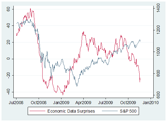
Hester: Economic Data Surprises index

I love Mondays. Why? Every Monday John Hussman, maybe the most brilliant mind in the business (let's say it's a tie with El-Erian), publishes his weekly market comment:
The cumulative tally of surprises in economic reports (a metric we credit to Bridgewater, which Bill Hester adapted here), has also turned down decidedly. Though the historical correlation is not always as strong as it has been during the recent downturn, shifts in economic surprises have tended to lead market turns in recent years.


Still, with market internals mixed but not clearly collapsing, prices strenuously overbought but still achieving marginal new highs, and valuations unfavorable but not as extreme as they were in 2000 or 2007, investors may be convinced that there is still a little bit of punch in the bowl

Sunday, November 22, 2009

CR: Effect of Fed buying MBS

From Calculated Risk Blog:
It isn't that Fannie and Freddie "can’t sell to an end buyer", it is that the GSEs [securities] will be selling for a lower price (higher yield) when the Fed completes the MBS purchase program. At that time mortgage rates will probably rise by about 35 bps to 50 bps (relative to the Ten Year) in order to attract other buyers. Alone that isn't all that "scary".
The Fed has issued more than a trillion Federal Reserve Notes (otherwise known as dollars) to buy mortgage backed securities. This is is serious currency debasement for 50 bps! However, I believe the total impact has been bigger: for one, it probably has driven Treasury yields lower than otherwise, so even though the effect on the spread is only 50 bps, the effect on the yield must have been bigger. Second, it has increased liquidity in this market and increased confidence (perception) towards the ability of the GSEs to retain their role in the financial system.

But combined with the growing problems at the FHA, the distortions in the housing market caused by the first-time home buyer tax credit, rising delinquencies, the uncertainty of the modification programs, and likely further house price declines in many bubble states - there are serious problems ahead for the housing market.
Click here for the full post.